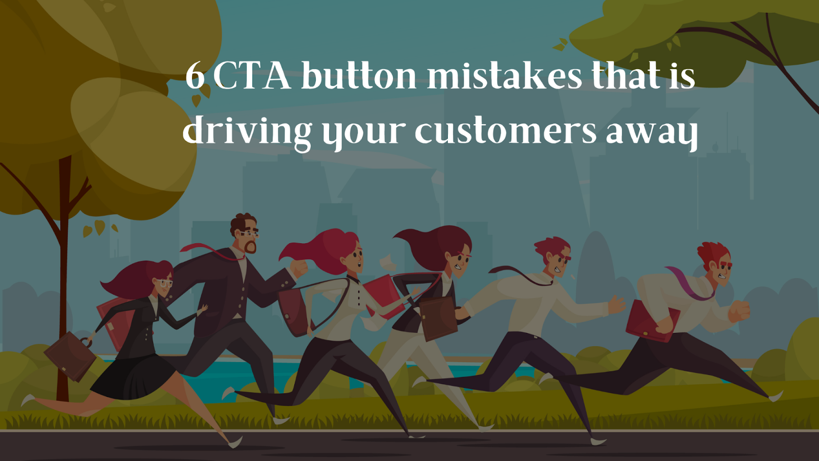
What’s the point of having a great website and well-optimized web pages if it doesn’t help you increase your sales? We all want more people to sign up for content, watch our demo, and most importantly, become our loyal customers, don’t we?
But, how do we do that?
How can we increasingly convert more visitors into customers?
Since you are here now, we’ll show how small changes to the Call-to-action (CTA) button have a major impact on visitor conversions. Continue reading to find out how successful companies are strategically incorporating CTA buttons into their websites.
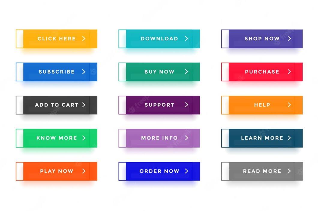
A Call-to-action on a website encourages the visitor to take some kind of action. It appears as a simple instructional text such as, “ call us now ”, “ find out more ”, “ buy now ”, “ visit a store today ”, and “ subscribe to our newsletter ”. In general, brands incorporate them into web pages, advertising messages, and sales scripts to convert visitors into leads and thereby generate sales.
After investing so much into building your website , the last thing you want is visitors leaving the site without taking any action. With a vague CTA or no CTA in place, the potential visitor who would have got converted into a lead would be lost, costing the business. To guide the visitors further down the sales funnel, brands must use Call-to-action strategically as part of their digital marketing strategy.
As your business grows and your website becomes more complex, it is necessary to keep your CTAs updated to appeal to different kinds of audiences such as visitors, promoters, and customers. However, this doesn’t mean that you should go overboard and create multiple CTAs.
With these CTA types, you will be able to drive more sales, know how you should place them strategically in different places, and even tailor them according to the user intent.
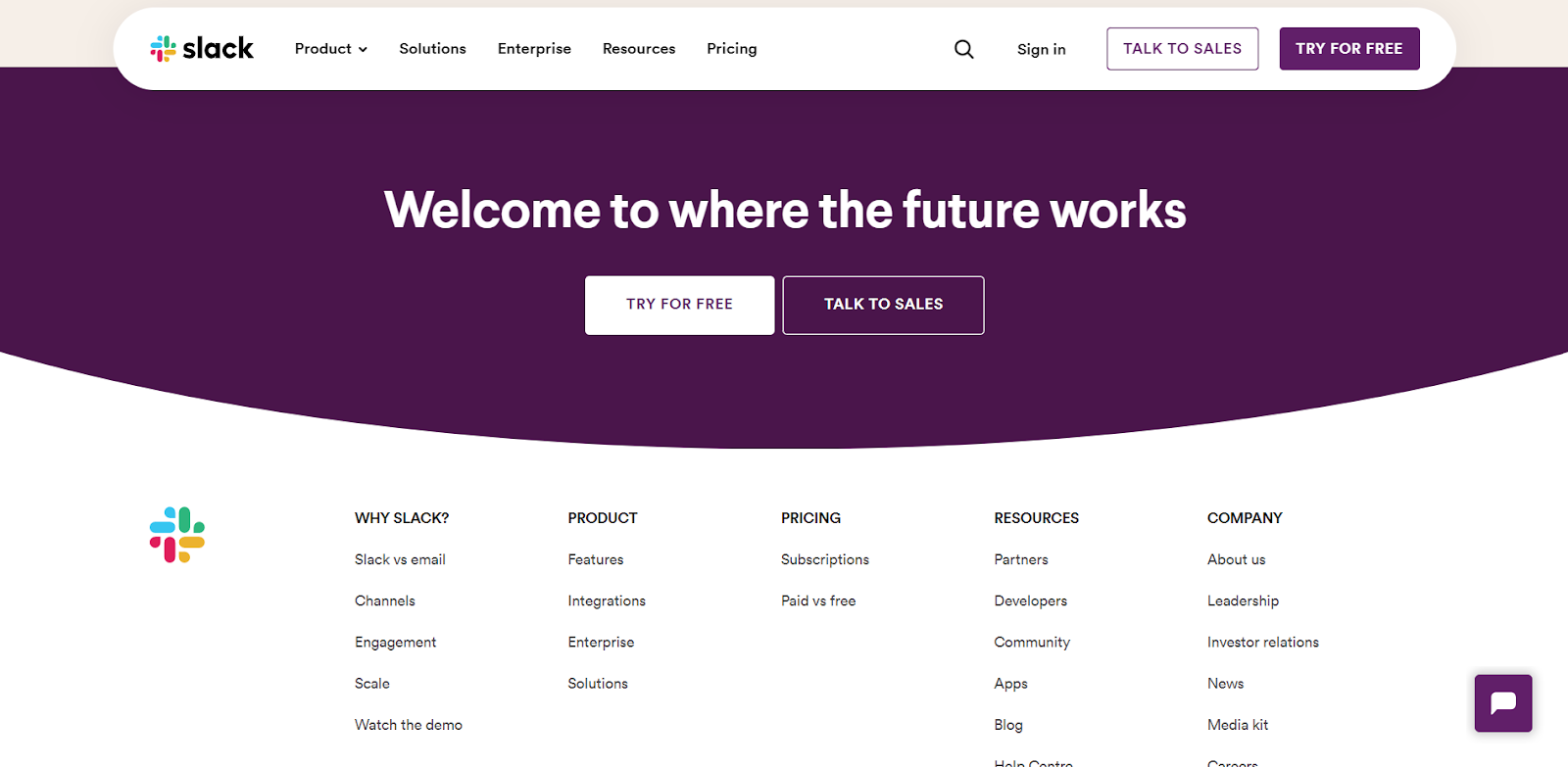
Image courtesy: Slack
Getting started is a highly actionable word that instructs the visitor to click and move forward to signing up. This CTA directly sets the expectations for the visitors, that once they create an account, they will start using the products and services.
Reassuring the visitors and adding essential value propositions your business offers is crucial before these call-to-action quotes.
Call-to-action quotes for getting started:
“Sign up for free”
“Join Free for a Month”
“Let’s start a project together”
“Start your free trial today”
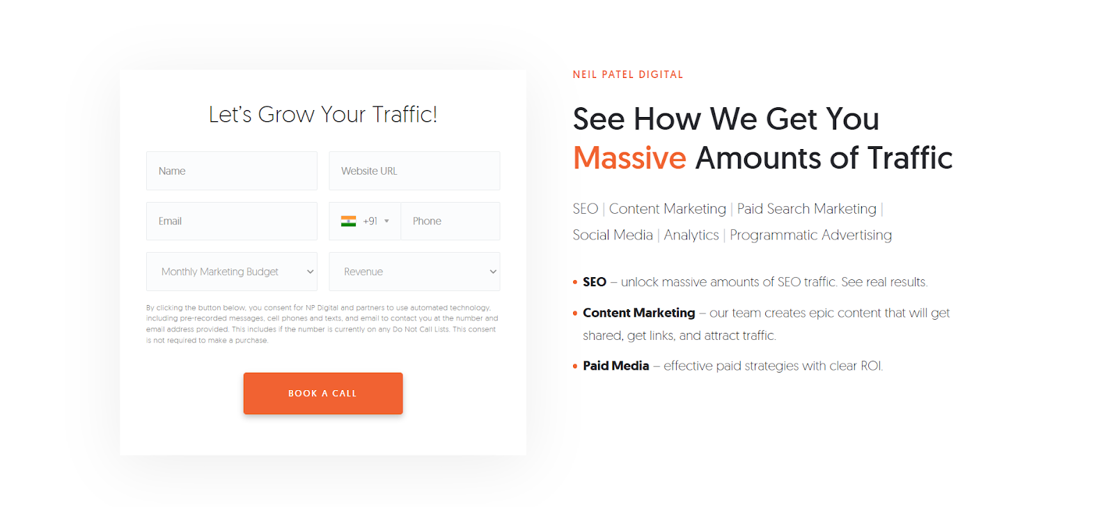
Image courtesy: Ubersuggest
The visitors will fill out the form when they are genuinely interested in knowing more about the products and services offered by a brand. The brands should entice them with attractive offers like free consultations, free trials, and demos to bring them even closer to a sale.
Call-to-action quotes for form submission:
“Contact us to know more”
“Schedule your free consultation today”
“Book a Call”
“Request a quote today”
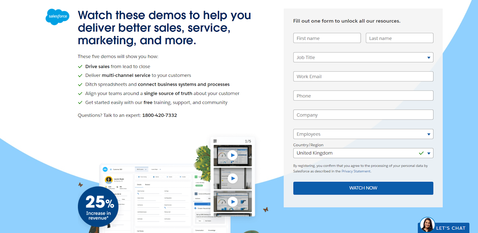
Image courtesy: Salesforce
Lead generation is the process where you gain the interest of visitors with a promise to provide valuable resources. You would want to place the lead generation CTAs on your high-traffic website pages. Most brands usually display them at the end of the blog posts, in the sidebar, and as a floating banner in the corner.
Call-to-action quotes for lead generation
“ Sign up and get an extra 10% off”
“Get the ebook for free”
“Subscribe to our newsletter”
“Start your free trial”
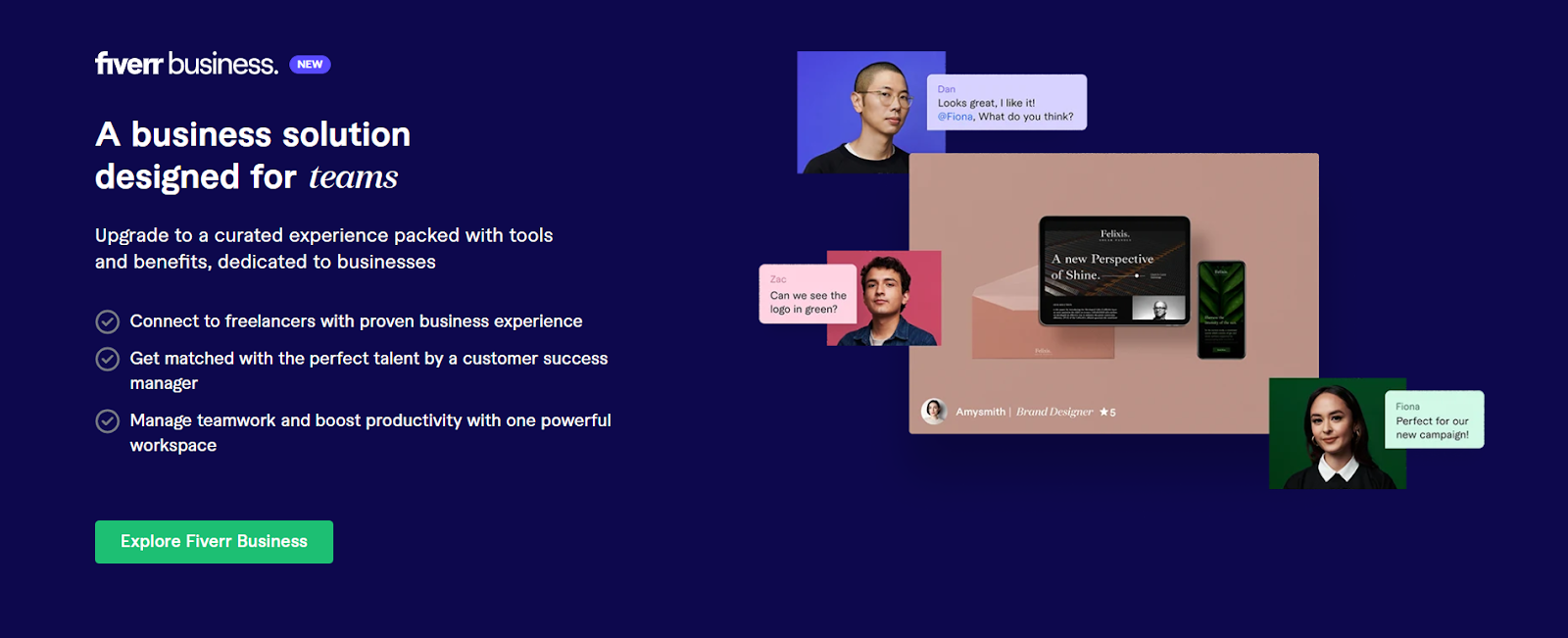
Image courtesy: Fiverr
There are times when the visitors will not be ready to buy from your brand right away. You need to earn their trust before the sale happens. That’s when this CTA button comes in handy as it provides extra information to the visitors and makes them 100% sure before they purchase your product.
Call-to-action quotes for read more
“Compare plans”
“Know more”
“Read more”
”Get more details”
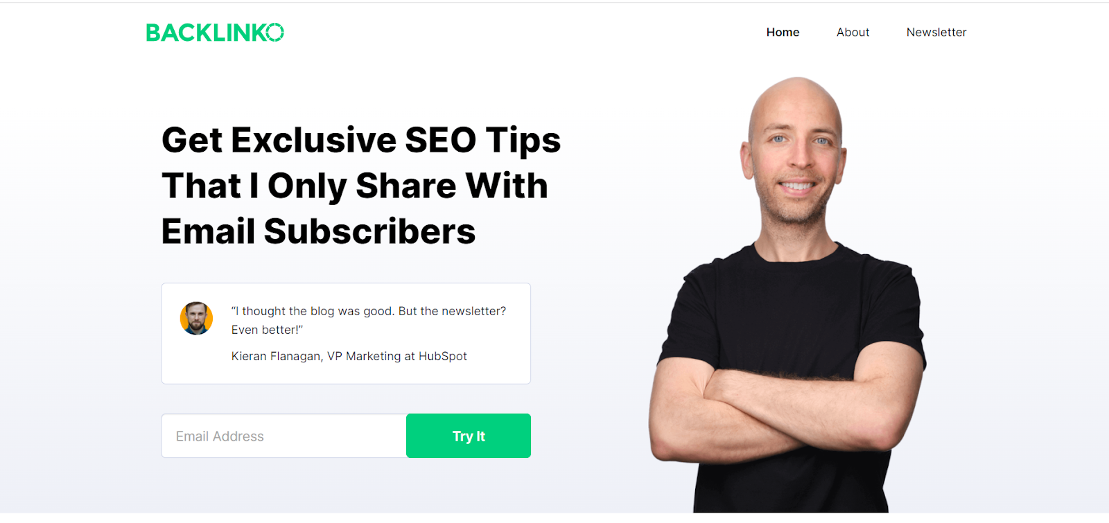
Image courtesy: Backlinko
A Newsletter Sign-up is the perfect way to capture email leads. The brands should use this CTA to engage the prospects with relevant content and information while leading them deeper into the sales funnel. The newsletter description should always be kept short and it should let the visitors know exactly what they are getting into.
Call-to-action quotes for a newsletter
“Subscribe to stay updated”
“Get instant access to fashion trends”
“Subscribe to our newsletter”
“Join our family of 10,000 subscribers”
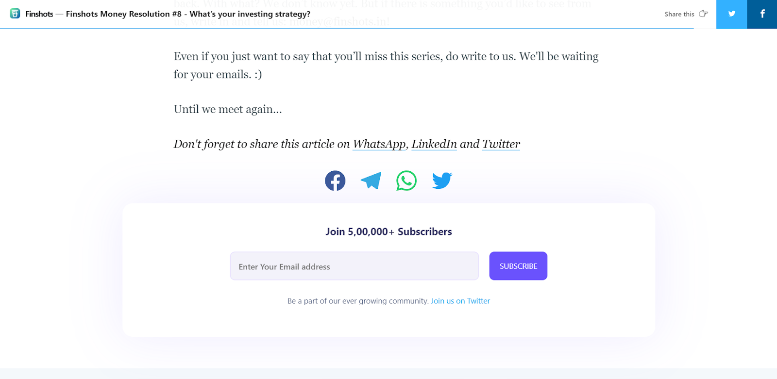
Image courtesy: Finshots
Brands who want to mark their presence on social media should use this CTA to encourage visitors to discover brands’ products and services and if they like, even share them with family and friends. The social sharing CTA placed at the end of a blog post helps readers interact with the brand actively.
Call-to-action quotes for social sharing
“ Follow us on our socials for latest updates”
“Join our social tribe”
“Let’s connect in Instagram”
“Share this blog to provide more value”
“Tag us on your socials”
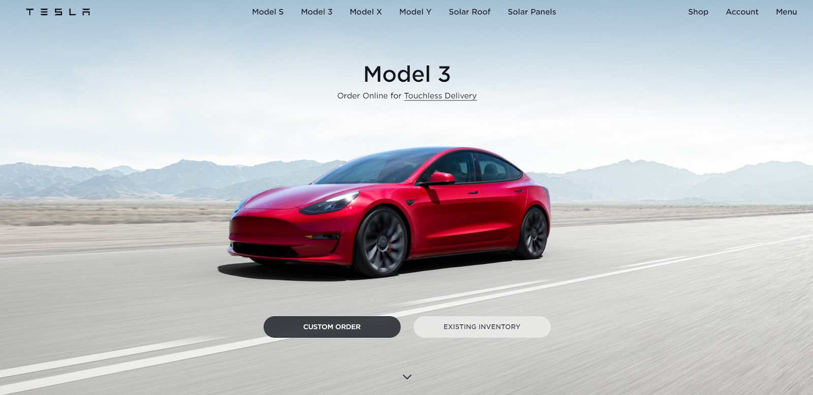
Image courtesy: Tesla
Closing the sale CTA is a sales-focused approach where brands urge potential customers to buy a brand’s products and services. It generally appears at the pricing page or product page and asks the visitor to do something to move the deal forward.
Call-to-action quotes for Closing/purchase
“Buy now”
“Choose plan”
“Make payment”
“Add to cart”
“Activate your 30-day free trial today!”
“Snag your free guide to getting more clients now”
A call-to-action is probably the first and last thing a visitor needs to look at when they are on your website. Follow these best practices to make a greater number of conversions and get more returns.
The words that you use in your CTA matter a lot. For example, “ Receive our newsletter ” is way better than c heck out our newsletter ” or “ Sign up for more information ”. The idea is to use actionable text in CTA without imposing anything on the visitors. It needs to be persuasive and the visitors would want to do what you want them to do on their own.
Most brands stick with green and orange colors alone as they believe it would give better results than others. However, it is important to test a wide range of colors to figure out what color works well with your audience. The best call-to-action should grab the user’s attention when they see it. Always remember to use a bright button color that contrasts the color of the web page.
Most brands use the rectangle shape CTA button on their websites. Other CTA button shapes that are popular with brands are rounded or squared-off rectangles, scalloped edges, and ovals. You can always experiment with button shapes by adding bevels, shadows, and hover effects. A little animation is fine, but don’t choose a button shape that customers find difficult to recognize.
Above the fold means anything on a webpage that is visible to the visitor without scrolling down. Placing your CTA above the fold creates wonders for your brand campaigns. But, it is not wise to place everything above just to grab the visitors’ attention. For example, calling on the new user to Sign Up for service as soon as they visit your site is a bad idea.
Brands should take advantage of customers' fear of missing out by providing a limited time offer like “ Limited stocks available ”, or “ Order before midnight to receive a 30% discount ”. However, a CTA need not always be action-oriented, sometimes it can be as simple as “ watch this video ”, “ check out this page ”.
Here’s a checklist of common mistakes that are committed by the majority of the brands. If you find yourself committing any of these mistakes, get them fixed as soon as possible.
If you are someone who is just starting to work on your CTA, don’t just use the word “ Submit” . Instead, use more actionable text like “ Get Your Free Trial ” and “ Download Now ”.
The majority of the brands try to hide their call-to-actions. As a result, the visitors will leave the site without taking any action. So, remember to place your CTAs within the visitor’s eye gaze.
Some brands oversell and underdeliver, losing customers’ trust. Your call-to-action should always match the expectations your brand sets.
Don’t ever commit the mistake of using similar colors in your CTAs that don’t blend in with background color. Always go for bold, contrasting colors.
Another mistake brands commit is using CTAs in the wrong place at the wrong time. It is crucial to understand the intent of the visitor and use them accordingly.
Lastly, visitors have a hard time zooming the web page to read your text, images, and CTA if your website is not mobile-friendly. Fix that.
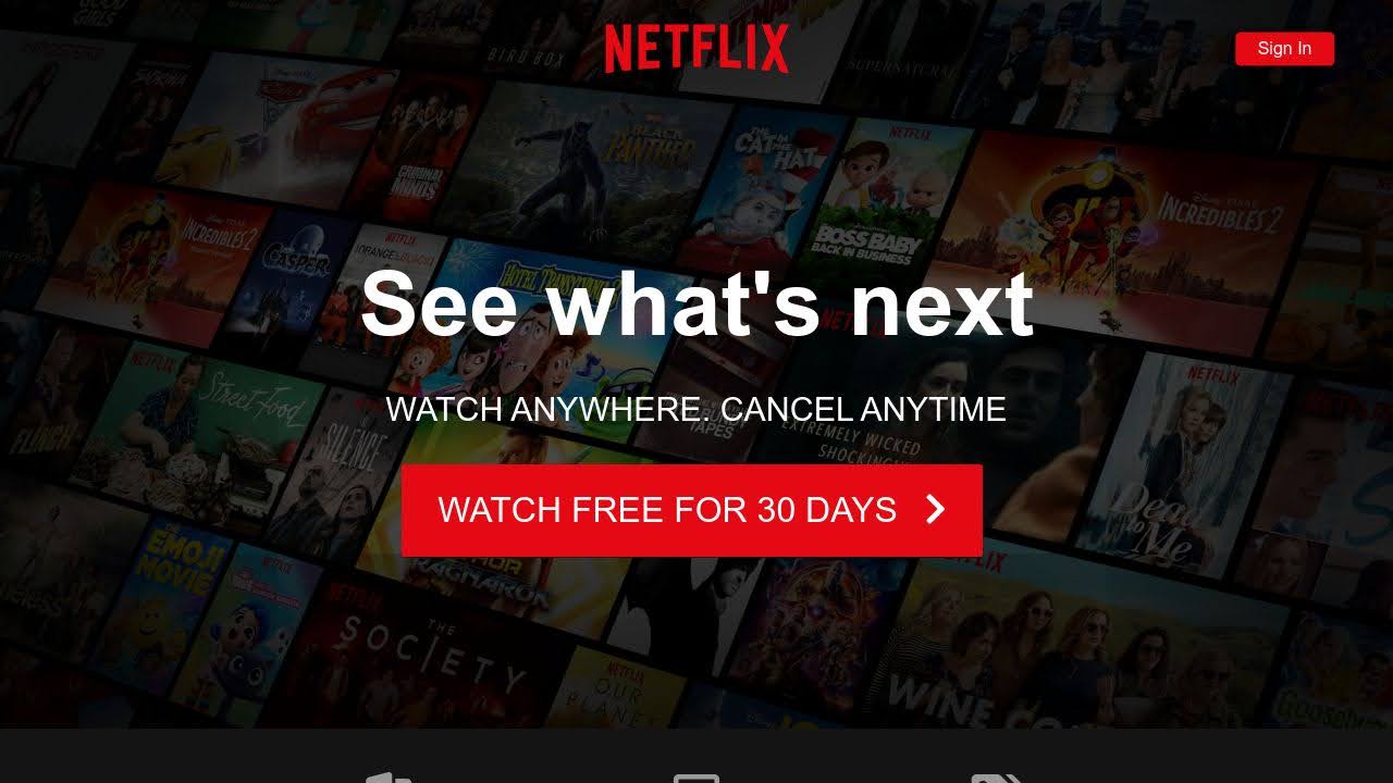
Image courtesy: Netflix
Committing to signing up for something is tough even when all the information about the products and services is mentioned on the products page. When a user visits the Netflix website, the first CTA they will come across is “ Join Free for a Month ”. Just right above this red-colored button, one can see, “ Watch anywhere ” and “ Cancel anytime ”. This not only reassures them but also boosts signups and increases the conversion rate. Also, the usage of red in primary and secondary CTA contrasts the black background color, grabbing users’ attention and matching Netflix logo color.
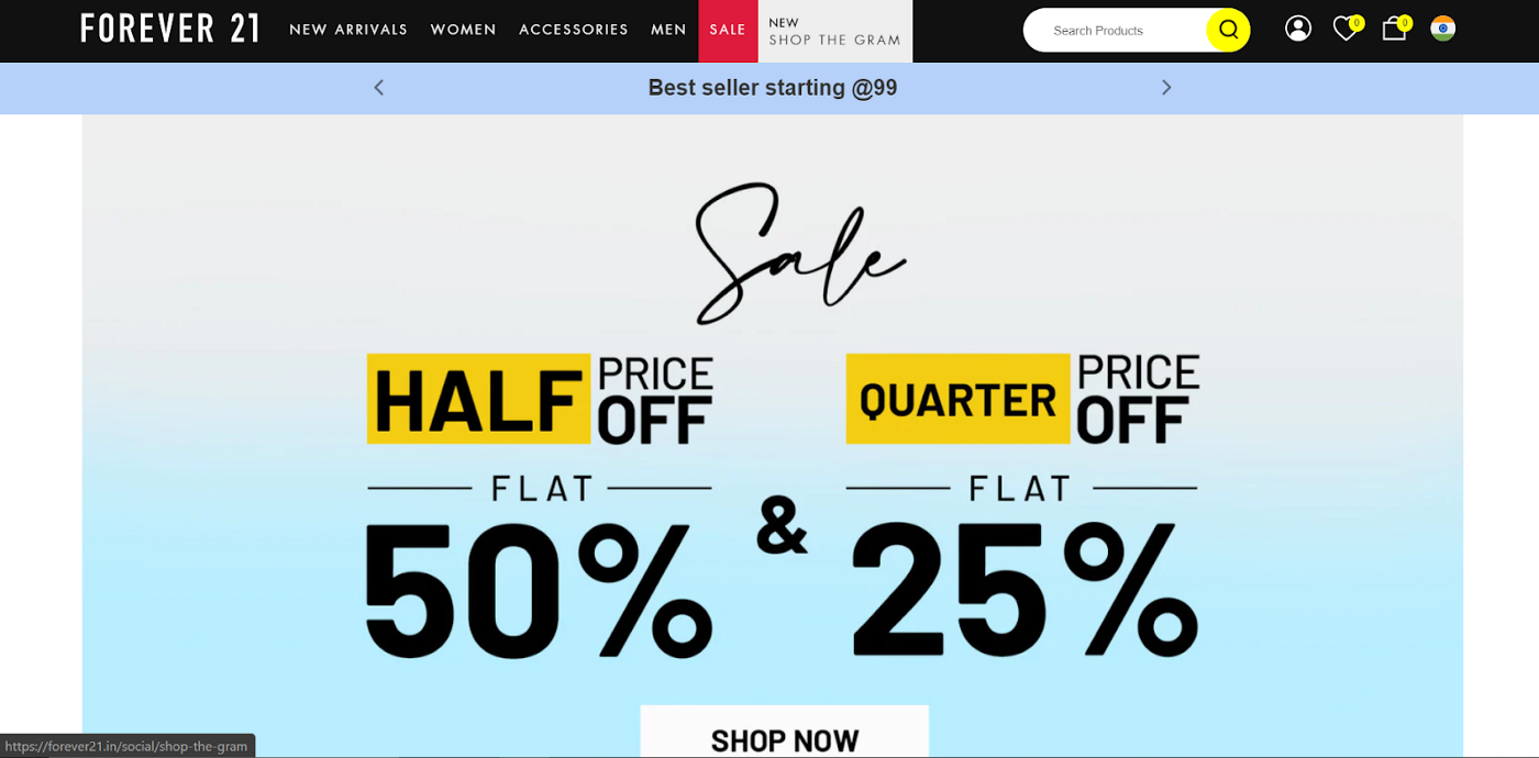
Image courtesy: Forever21
When the users stumble upon the Forever 21 website to browse through their products, the discounts grab users’ attention. On their landing page, the words “ Flat 50% Off + Flat 25% off '' are highlighted in the center with a bold text. Just below this, they have added a very clear call-to-action step “ shop now” . The rationale behind this is it grabs the attention of the user by giving the offer and keeps them longer on their website to purchase something.
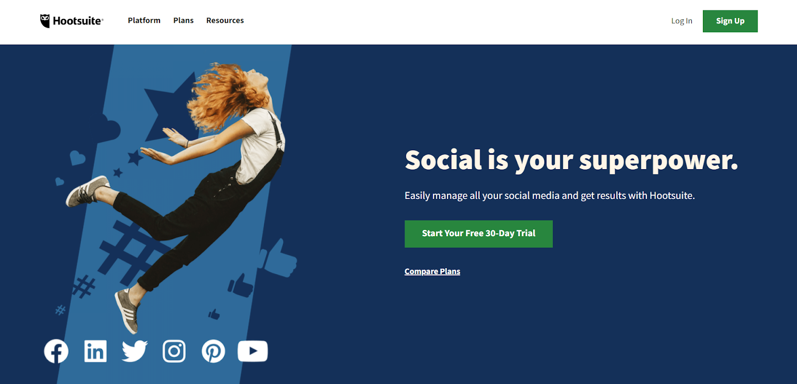
Image courtesy: Hootsuite
Hootsuite is an automation platform for organizing and sharing social media posts. The brand very well understands that its target audience is people who want to grow their social media audience. So, the first thing the visitors notice on the website are the words “ Social is your superpower ” and just underneath it, the users notice a lead generation CTA button, “ start your free 30-Day trial ” in green color. The brand has also added “ compare plans ” CTA in the landing page within visitors’ gaze. Overall, the brand has structured crucial elements without the user scrolling down the webpage.
A good CTA needs to be clear and witty, without looking too pushy. The Call-to-actions nudge the viewers to take the right action by providing explicit instructions on what to do next. Experiment with the CTAs by switching up the words, colors, images, fonts and see what drives the traffic best. Remember, even a small change can make a world of difference. If you are ever confused about what CTAs to use and what you should avoid, without a second thought, go with Workik's readily available expert-curated Call-to-action widgets that you can easily drag and drop on your website.